Access
To avoid signing up, you may log in with the following credentials:
tester2@gmail.com // testtestFeatures
Secure login with Passport Auth
Cache for external API calls to Unsplash
Uploads pictures to Cloudinary or retrieves a random one if Classroom creation form is left empty
Users don't need to log in to access a Classroom, but their usage is limited
Students who are logged in can leave comments in lessons and track lesson completion
Light and dark mode toggle
Prompts and mobile menu are contained in accessible modals
Responsive for desktop & mobile
Project gallery
Landing Page
Visitors can input a classroom password and access it without logging in. As for the styling, a random image is fetched from Unsplash's API using the keywords 'work from home'. Due to the limitations on the number of requests per hour, the landing page will cache the API response and only refresh after 10 minutes have passed.

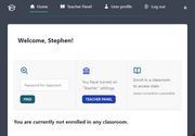
Home page
If a user has registered as an educator, then the navigation menu will display the link to the teacher panel. The quick actions and stats section will display the number of classrooms the user has enrolled in, and what is the percentage of lesson completion.

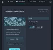
Classroom management (dark mode)
The teacher panel will display all classrooms created by the user, who can then manage each one separately: editing, deleting, or adding lessons to the class.

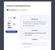
Lesson (light mode)
If a user is logged in and enrolled in a classroom the option to post and read comments, as well as mark a lesson as completed, will show up.

Roadmap
or: what I would like to implement given more time
Add more authentication methods
Enable password change and recovery
Add button to share classroom directly
Add tests
Lessons learned
In this project, it turned out to be simpler to create an Enrollment model schema rather than integrate students, classrooms and lessons directly. Less turned out to be more.
Rendering a classroom using EJS while taking into account the enrollment status and user authentication was a fun challenge which would have been made much easier with front end libraries such as React.
When it comes to text, CSS `text-transform: uppercase` also directly affects the element, and so adding aria-labels to buttons might seem like extra work but cannot be skipped.
While I did choose a pre-made color theme which looked fine at first, it turned out to not generate the sufficient contrast in some elements so I had to add further customization.