Access
To avoid signing up, you may log in with the following credentials:
tester3@gmail.com // testtestFeatures
Secure login with Passport Auth
Cache for external API calls to Unsplash
Uploads to Cloudinary, with different sizes for post and profile pictures
Light and dark mode toggle
Prompts and mobile menu are contained in accessible modals
Responsive for desktop & mobile
Project gallery
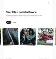
Landing Page (light mode)
A random set of images is fetched from Unsplash's API using the keywords 'happy friends'. Due to the limitations on the number of requests per hour, the landing page will cache the API response and only refresh after 10 minutes have passed.

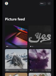
Picture feed (smaller screen, dark mode)
Pictures are displayed anonymously, sorted by latest on top, and only the number of likes is displayed on the page feed. To see a post's creator and access comments, viewers must access the post itself.

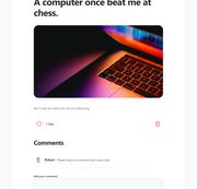
Post (light mode)
The picture itself is the main attraction of a post's page, with a smaller caption below. The option to delete a post appears only to the creator, much like happens with comments.

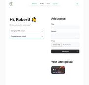
User profile (light mode)
Users are greeted by name, then offered options to update their profile. For simplicity's sake, as of now the options to add a new post and to view a user's own latest posts are included in this section.

Roadmap
or: what I would like to implement given more time
Add more authentication methods
Enable password change and recovery
Add public and private posts
Add share option
Add tests
Lessons learned
When possible, the use of semantic HTML5 rather than customized solutions, i.e. Details rather than a fully custom accordion, can solve a lot of accessibility issues.
Thorough planning and design must be done before implementing changes or new features. An example: when a Comment model is created with Mongoose without a reference to the poster's profile picture, for instance, even when that is added to future versions it still means previous comments will not have a picture attached automatically to them.
Tailwind is a tool that makes implementing designs a lot faster, even if the HTML ends up looking very polluted with classes. Customizing colors and themes is fun!